
Two of my first Brooklyn friends - Jaime and Alyssa are launching their Ex-Oh collection for LOVE BRIGADE. An absolutely gorgeous brand meant for rockstars with excellent taste. CLICK flyer for details. 
31 August 2008
Love Brigade's Official Launch of Ex-Oh!
29 August 2008
MAGIC/S.L.A.T.E. show with In4mation
Hey all! If any of you were curious as to what happens during MAGIC tradeshow and Project, feel free to peep out my post on fatlace.com/yoshi. Here are a few photos for you to enjoy! Just got back from Vegas this morning and will now prepare for my next tradeshow in San Diego in a couple of days - AGH!
MORE HERE


Courtney's Type Tricks and Tips
Because last week was pretty hectic I have a double whammy of information!
Since my team are wrapping up holiday, I've decided to do a little on Initial Caps, Alternate Swashes, and little on Humanist type period.
Intial Caps or drop caps, what is the diff?
Intial caps are over sized letterforms that starts at the beginning of paragraphs using only the first letter of the first word of the first paragraph. The initial may sit on the same baseline as the first line of text, at the same margin.
Drop caps has the same purpose but the intial sits within the margins and runs several lines deep into the paragraph pushing some normal-sized text off these lines.
This style of typography dates back to the super old days try circa 200 when manuscripts were handwritten. Because of its popularity it has been passed down as a tradition of Roman text, It has lasted through out the periods of typography movements and can be used today. I think the best way to utilize this treatment is to find a typeface that has simuliar qualities of the your text typeface. Because intial caps do not come as a family of fonts such as Helvetica (roman, italic, bold, etc) you would have to silulate that both typefaces belong together. Also dont forget to work with the initial caps--that is to fix the kerning and baseline shift of the typefaces.
For more fun info lookie here: http://en.wikipedia.org/wiki/Initial
Alternate swashes
Another fun way to work with type is to use alternate swashes. It was developed out of using letterforms from calligraphers. Typically swashes are used at the beginning or the end of a word. However, it is not limited to only that usage. Some typefaces have alternate swashes for letterforms that work in a word that is not at the beginning or at the end, but does not read very well.
A typeface that we have that we can use is Zapfino. Some swash letters can be added almost anywhere. Avalon, Bookman, Garamond, also has alternate swashes. Those are some that are off the top of my head. I will further research what typefaces are available in our library.
For more fun info lookie here: http://en.wikipedia.org/wiki/Swash_(typography)
Humanist period in Typography
So with all the Holiday cards, i chose to highlight the humanist period...why? Well it seems that with the religious tie of Christmas, although we recognize all kinds of religions, winter, santa claus, and holiday in general that majority of the typefaces that fit are from this period.
The Humanist types (sometimes referred to as Venetian) appeared during the 1460s and 1470s, and were modelled not on the dark gothic scripts like textura, but on the lighter, more open forms of the Italian humanist writers. The Humanist types were at the same time the first roman types.
Characteristics
So what makes Humanist, Humanist? What distinguishes it from other styles? What are its main characteristics?
1 Sloping cross-bar on the lowercase “e”;
2 Relatively small x-height;3 Low contrast between “thick” and “thin” strokes (basically that means that there is little variation in the stroke width);
4 Dark colour (not a reference to colour in the traditional sense, but the overall lightness or darkness of the page). To get a better impression of a page’s “colour” look at it through half-closed eyes.
For more fun info lookie here: http://ilovetypography.com/2007/11/06/type-terminology-humanist-2/
Adjust Baseline shift in InDesign
Move Up by Increment Option-Shift-up arrow
Move Down by Increment Option-Shift-down arrow
(add Cmd to the above keystrokes to make them Increment x 5)
25 August 2008
REVOLVEClothing Flagship in LA
Message from REVOLVEClothing.com:
As of this weekend, the doors to our new flagship store will be officially open!
Now you can shop all your favorite REVOLVEClothing.com styles online and off! Located at 8452 Melrose Avenue in West Hollywood, the two-story fashion gallery features curated collections of men's and women's clothing and carries brands like S.W.O.R.D., B. Son, Won Hundred, YMC, Dolan, Sylvia Rielle (her designs are super hard to find here in the States), and many, many more. There's a whole floor dedicated to shoes, rad art on the walls by MWM, and a sweet outdoor patio for pre, post or mid-shopping relaxation.
Happy Shopping!
REVOLVEClothing
8452 Melrose Ave
West Hollywood, CA 90069
(behind Taste Restaurant)


23 August 2008
Live Green/Buy Vintage
Okay, so these Store and Website reviews are wayyyyyyyyyyyyyyy long overdue. & Just so you know, I am very happy to and willing to go shopping in the name of research, so if you would like me to check out a store or site for you feel free to let me know :-). Again, sorry...I checked/shopped these 2 sites back in June and it is now August.
So I love vintage as much as the next person, problem is I really hate sifting through all the junk to get to the treasure. I know, I know...I'm sure the real die-hard Vintage buffs are yelling at their computer screens right now... the rack rummaging is part of the thrill,right? Well for me it isn't. That is why I was excited when I discovered these two sites: American Apparel's (AA) California Select Vintage store and Nasty Gal Vintage.
American Apparel California Select Vintage and more...
So initially I was very excited about this site because AA:
1. Did the work for me by picking out cute pieces
2. Gave me the clothing specs such as sizes, labels, measurements, materials
3. Started all bids at $9.99
4. Offered reduced shipping if you ordered several pieces at once
But before I started eBay bidding like crazy I decided to check out their actual store location in Echo Park. Together with my boyfriend we tried on about 10-15 pieces. Let me tell you, I'm not stick skinny, but I'm a pretty petite girl...and not one thing fit me or my boyfriend (no we didn't try on the same things). Bottom line is I must be The Incredible Hulk according to 70 and 80's standards and that has ultimately made me hesitant to order any vintage clothing online. Nevertheless I went home with a hot pink ruffled night gown, tan leather vest, and blue straw clutch all for about $60 some dollars...
California Select Blog
Nasty Gal Vintage
This Bay Area based owner, Sophia Amoruso, has great taste in picking out these one-of-a-kind quality vintage goods....but from my previous experience with AA I'm a little wary of ordering vintage clothing on-line. If these fits' perfectly hug these models' bodies...I'll be lucky if I can stick one leg into these very cute frocks. But I'll probably give into temptation b/c her stuff is just soooo gooood.
But Hey! that doesn't mean I can't order their accessories. She has a great Eyewear selection. So far I've ordered these France Romance Shades in Metallic Silver for $40. These are my version of the oh-so-hipster Rayban Wayfarers, which doesn't fit my face anyways...Wayfarers make my face look ChubCity! lol....oh I also bought their heart frames in purple...
Peep the Nasty Gal Blog for updates, info, and for more pics of this NastyGal model....she's real pretty don't you think?!


Rock Band-O
These are soooooooooooooo cute!!!! But range from about $75-150...hmmm I think its Arts n' Crafts time!!
But if you are lazy, have no glue gun skills, and/or have cash to spare check it out at Bando
All pieces are one-of-a-kind and even come with their very own special Haiku!


Your Slip Is Showing
Need an interesting way to update your LBD, mini-skirt, or T-shirt Dress? Check out Your Slip is Showing (YSIS) for these unique updates and many more ranging from $100 to $300 which is a cheaper alternative to the Elizabeth and James Feather James Blazer pictured below...These are my YSIS picks made with Ostrich Feathers.
Madam! Feather Slip $300
Madam! Salt and Pepper $300
Elizabeth and James Feather James Blazer $765


22 August 2008
"My New York Story"
It is day 4 in my new city of New York City and I appreciate your patience while I quickly work on getting settled in so I can get back to business. In the meantime I'll keep you busy with "My New York Story"...
Okay so you are probably wondering what the deal is with these random pics? Well it turns out I sat next to Gabriel on my flight over from SFO to JFK, who is the guy pictured above as well as an actor/model born and raised in Berkeley, studied in London, and now currently working in NYC. He is also the model featured in the Seven for All Mankind Fall 2008 Collection Campaign. I couldn't find the ads to post here, but there is a great video describing the process and vision behind the shoot which was shot at the iconic Glass House. Otherwise, the Seven ads are all over...and yes I sat next to him :-)
click here for the video.
7 For All Mankind broke new ground by choosing architect Philip Johnson’s iconic Glass House as the backdrop for the company’s fall 2008 advertising campaign. The March 2008 shoot was monumental for both the fashion and architectural worlds as it marked the first commercial shoot to take place at the historic site. The Glass House was the ideal setting for this season’s campaign as it effortlessly conveys 7 For All Mankind’s brand vision of luxurious style and sexy sophistication.
The Glass House was built in 1949 in New Canaan, Connecticut, and was designed by famed architect Philip Johnson as his own residence and is a masterpiece in the use of glass. In 1997 the house was declared a National Historic Landmark. After Johnson’s death in 2005, the house was passed to the National Trust for Historic Preservation. In April 2007 the house was finally opened to guided tours of the property. The mission of the Philip Johnson Glass House is for the 47-acre campus to become a center-point and catalyst for the preservation of modern architecture, landscape, and art, and a canvas for inspiration, experimentation and cultivation honoring the legacy of Philip Johnson (1906–2005) and David Whitney (1939–2005). In addition to guided tours, the Glass House will launch programs and provide national leadership in the preservation of the Modern.
For more information about The Glass House, please visit www.philipjohnsonglasshouse.org.
7 For All Mankind supports the National Trust for Historic Preservation's efforts to save Modernism's legacy.
For more information about the National Trust for Historic Preservation, please visit www.preservationnation.org/modern.
Press Release


18 August 2008
August Summer "Simma Down" Playlist composed with Koderville

Summer sure is coming to a slooooooow down. So it is time my friend to start to close shop, but not without a good soundtrack for those last memories of the summer. Thankfully fellow blogger, Koderville (see Support and Supporters to the right-->) has helped iDR put together this playlist. Known for his picks of hip hop, and rap genre he gave us a flavorful palette of music that you'd want to bookmark until winter! Its a little bit of everything, I've added some girly stuff like Rihanna's new dance hit Disturbia. I will let you be the judge....shouts to Koderville and to you, our listeners.
Hellz Bellz interview with Lanie!
Itsdesignrelated.com got a chance to catch up with Lanie from Hellz Bellz check it out the interview!
Hellz-Bellz: "a tribute to non-conforming female youth of today." Tag team partners for life, Miss Lawn and Bam have risen to the top of lady lifestyle apparel by dominating the street scene all over the world with their eye catching and innovative designs. Read more about their passions, their struggles, their inspirations...
if iDR opened your purse and dumped everything out...what would
expect us to see?
I carry huge bags, so here you go: BlackBerry World Edition, Burt's
Bees® Beeswax Lip Balm, business cards, clean sheet notebook, Crooks &
Castles wallet (that holds way too many credit cards), Evian water
bottle, Lancome Juicy Tube, Sharpie highlighter, 2 LA Parking tickets,
#5 Mechanical pencil, Gucci make-up bag, Porter camera case for my
Canon digital elph, and tons of loose change
Favorite city?
New York City
Lanie, you must travel a lot...in cases of a delayed flight...what
do you do to remain calm, and occupied?
I work on my laptop/black berry or just chill out and listen to my iPod
What is currently playing on your iPod?
Ryan Leslie | Addiction

By building your brand do you feel that you've developed a
following.
Developing a following with Hellz wasn't initially the goal when
starting Hellz. When I started Hellz, it was more of an outlet for my
creativity than a "brand". After a span of 3 years, it's grown from a
part time hobbie to a full time hobbie that puts food on the table. I
say hobbie, 'cause I'm having way too much fun doing this to even call
it a job. But amidst all the fun and hard work, we've created a
following of strong, intelligent women who are able to relate to me
and what Hellz is all about.
Through being able to profile and understand purchasing patterns of your customer, has it influence your creativity or business decisions?
Although most companies keep in mind what sells and what doesn't when
designing, I try to not let it influence my creativity or business
decisions. I have to be confident in myself that even though there's a
style/graphic that doesn't sell well in retail that that doesn't mean
it sucked. There's been so many times that I've designed something and
buyers/consumers just didn't get it, then next thing you know another
company does something similar to it 2 seasons later and it becomes a
hit... urgh, that can be so frustrating. So as a creative person and
forward designer, it's my job to continue to push the limits of
design. The last thing that I want with my company, is to let buyers
or purchasing patterns of my customer dictate how I design.


Not many people know that Hellz is owned and designed by a wife and husband tag team. Some of us would imagine these ingenius designs might spring from a conversation during a home-cooked dinner!?
Yeah, both Bam and I own Hellz :) Not a lot of people know because for
a while I was designing Hellz on my own. Then luckily, I was able to
convince him to get on board and help me out. It's strange because in
so many ways we're alike and not alike in the way we design and work,
however somehow we make it work and we're the best "tag team".
Everyone always asks me, "How are you able to work and live w/ your
husband?" and my answer is always, "I don't know, it just works".
There's nothing better than working with your best friend... but like
all relationships we're gonna have times where we butt heads and have
disagreements, but we've learned how to work things out and not allow
any work issues bleed into our personal lives as husband wife.
That's funny that you say people would imagine us coming up w/ ideas
over dinner, because that's what happens a lot of the times, lol.
A lot of people look to HB as the first women's wear in a heavily male dominated industry. How do you find HBs position an advantage? Do you look to the guys lines as a source of inspiration?
Well, first of all Hellz definitely isn't the first female line in
street wear... there's been other lines like, MOB and Claw Money that
were established before Hellz was. I'm always honored to be
categorized with brands such as theirs. Just to be a part of this
movement of females stepping up and doing their thing (and killing it)
in an industry that's typically run by males is not only liberating
but also very empowering. We've been able to create a niche that was
untapped prior to us coming along. Now you have other female brands
coming up who have seen us as great inspirations for what they do,
whereas a few years back the only source of inspiration for us were
men's lines... it's dope to see that that isn't the case anymore.
iDR loves that you pick iconic, strong women of the 70s and 80s. If you could pick a batch of women today, which ladies would you like to add to your list?
Agyness Deyn, Kate Moss, Omahrya Mota, Santi White, Chloe Sevigney,
Angelina Jolie
check some of their favorite chicas of today!
How do you find HB paving way for future women's wear brands?
Hellz is opening up doors and creating opportunities for future
women's brands that weren't so opened minded to the thought of women
making a name for themselves in this crazy male dominated industry.
iDR cant get enough of your clever wittiness in your writing on your tees. How do you create these tees? Do you think of a strong direction in writing first or does the art/graphics/theme direct the writing?
Everything begins with an idea and goes from there. We'll take that
idea, do research and create a concept that's cohesive amongst the
graphics, design and verbage.


What is your process in developing a whole collection?
Research, research and more research
is there anything else you would like to tell your fans, friends, peers, women in pursuit of fashion?
Follow your heart and let your passion for fashion take you to where you wanna go to achieve whatever goals you may have... and do you and fuck the rest!!


Thanks Lanie for taking the time to catch up with us! All of the editors here are super excited to see your new goods. It's definitely inspiring to see women in the creative fields such as fashion succeed and prosper.
To see more of Lanie and her awesome line, check out her site: WWW.HELLZ-BELLZ.COM
Interview conducted by Courtney
Produced by Jessica
*thanks for the love! feel free to repost, link back to us and cite the source. mucho thanks!*
13 August 2008
Nikita Photoshoot Contest!
Nikita is back with the second photoshoot contest opportunity!
Twice a year, Nikita takes its newest and hottest designs to some amazing locations around the globe. They shoot the photos with some of the coolest girls on the planet (i.e. from the Nikita team) and showcase the brand new collections through their catalogues, via websites and other mediums, throughout the world.
Just last year and for the first ever time, Nikita invited some girls through the launch of a little photoshoot contest and picked out three lucky ladies as special guests to join them on the journey. The lucky winners, selected from hundreds of entries, earned themselves some cool photos along with some great times with the Nikita crew and of course, a bundle of new clothes to take home!
* * * Last year’s winners shot on location in Vancouver * * *
Check it out for your chance to be a Nikita gal on the next trip happening October 2008! The winning girls (one from the US and one from Europe) will be flown to the secret location where the photoshoot will be held. They will join the Nikita crew from Iceland, including founder and head designer Heida Birgisdottir and members of the Nikita team.
ENTRY DETAILS:
Get snappy with some sassy snaps of yourself and e-mail them over. Photos can be as funny, wild and creative as you want to make them but we also do wanna see what you look like and hear about what you enjoy doing.
Name, address, date of birth and contact details are essential, so please don’t forget to include them. You can send in as many pictures as you want but total file size of all the pictures must not exceed 2 MB. E-mail your entries to interns@nikitaclothing.com before 15th September 2008.
Please note that entrants must be 18 years old or over as of October 1st 2008. Entrants must also have a valid passport.
Your entries will be showcased via Nikita’s website, Myspace, Facebook and Mpora! Make it happen and make it good!
You can check out some of the winner’s entries from last year HERE
www.nikitaclothing.com

12 August 2008
Courtney's Type Tricks and Tips
Another weekly dose!
On choosing Type
Typography is not a science. Typography is an art. There are those who’d like to ‘scientificize’; those who believe that a large enough sample of data will somehow elicit good typography. However, this sausage-machine mentality will only ever produce sausages. That typography and choosing type is not a science trammeled by axioms and rules is a cause to rejoice.
For further reading: http://ilovetypography.com/2008/04/04/on-choosing-type/
Something Interesting: Kinetic Typography
Kinetic typography refers to the art and technique of expression with animated text. Similar to the study of traditional typography of designing static typographic forms, kinetic typography focuses on understanding the effect time has on the expression of text. Kinetic typography has demonstrated the ability to add significant emotive content and appeal to expressive text, allowing some of the qualities normally found in film and the spoken word to be added to static text. Kinetic type has been widely and successfully used in film as well as in television and computer-based advertising. Perceptual psychology research on attention, reading performance, and comprehension has indicated that time-based presentation of text can be used effectively to capture and manipulate a viewer’s attention and in some cases improve overall reading performance.
For further reading: http://www.cs.cmu.edu/~johnny/kt/
Indesign Keyboard Shortcuts for Styling Text
Bold: Cmd-Shift-B
Italic: Cmd-Shift-I
Normal: Cmd-Shift-Y
All Cap: Cmd-Shift-K
Edit Style Sheet without Applying it: Cmd-Option-Shift-Double click style

11 August 2008
ITSDESIGNRELATED.COM's Krazy Kids Radio ReCap!
You know that feeling when you hear yourself talk on voicemail? Or even on the answering machine? Somehow the way you think you sound like is not close to what comes out of the little speakers, ugh! Well that was what it was like when I heard my own voice on the Krazy Kids Radio! At the very least the DJ's Ant-1, Ruby Red-I and JBoo were generous enough to let me come by to take some pics. Lucky me it was a "BEST OF GIRL GROUPS" playlist, hmmm even better!
Check out the photos, but let me warn you this mix is beyond what is played in this little clip...there's so much more old and new, fun and funky so I encourage you to download this mix here!
ITSDESIGNRELATED.COM Visits Krazy Kids Radio from itsdesignrelated.com on Vimeo.
Green Label Art Volume 2
6 New Artists 6 New Bottles
www.greenlableart.com
Featured Artists:
Mark Smith, Brand Jordan
PJ Richardson, Stussy designer
Mike Sutfin, Star Wars & World of Warcraft illustrator
Maze, Kidrobot
Troy Denning, Invisible NYC tattoo artist
Billy The Artist, New York artists

Fatlace & itsdesignrelated.com's Art Unlimited Event Recap!
itsdesignrelated.com's Art Unlimited from itsdesignrelated.com on Vimeo.
In case you didn't get a chance to pass by Fatlace, peep this clip. It's a snip of what when down; a jump off to an awesome Saturday nite! There was wine, cheese, koi fishes, bikes, friends, black and white photography, chatter, illustration, bumpin music, hugs, walking in and out of fatlace, smiles, exchanging phone numbers, folks chillen, lots and lots went down. We only hope to do it again, as iDR enjoyed supporting the artists along with our friends over at FATLACE.
Of course this wouldn't have happen without a lot of help. So here are the people we heart so much:
Mark and Ronnie over at Fatlace (big thanks, if it wasnt for you two this wouldnt have happened)
Paloma with Illiteracy
Ant 1 and $ir Tipp with Ri$ky Bizness
and all of the artists: Steve Ha, Phil Mamuyac, Marcus Ubungen, and Samual Rodriguez.
and of course those who plugged us, thanks thanks
Wild 'N Krazy Kidz
Ri$ky Bizness
Social Lush
Design Rehab
Plstk
Your Pal Marcus
Slam X Hype
Tell.A.Vision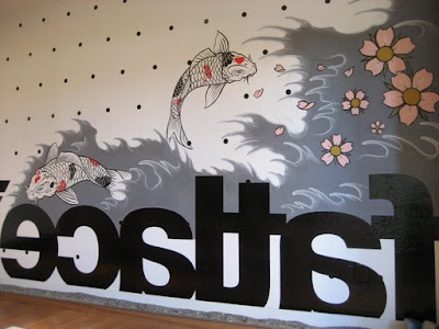


additional photos contributed by Paloma, thanks!
Subscribe to:
Comments (Atom)


